Book Typesetting: The Complete Guide to Professional Interior Layout
Learn book typesetting fundamentals — fonts, spacing, margins, and more. Master professional interior layout or let AI handle it for you.


So your manuscript is done. Editing is behind you. You're ready to publish. But there's an invisible step between "finished manuscript" and "finished book" that most readers never think about — yet they notice right away when it's done badly.
That step is typesetting.
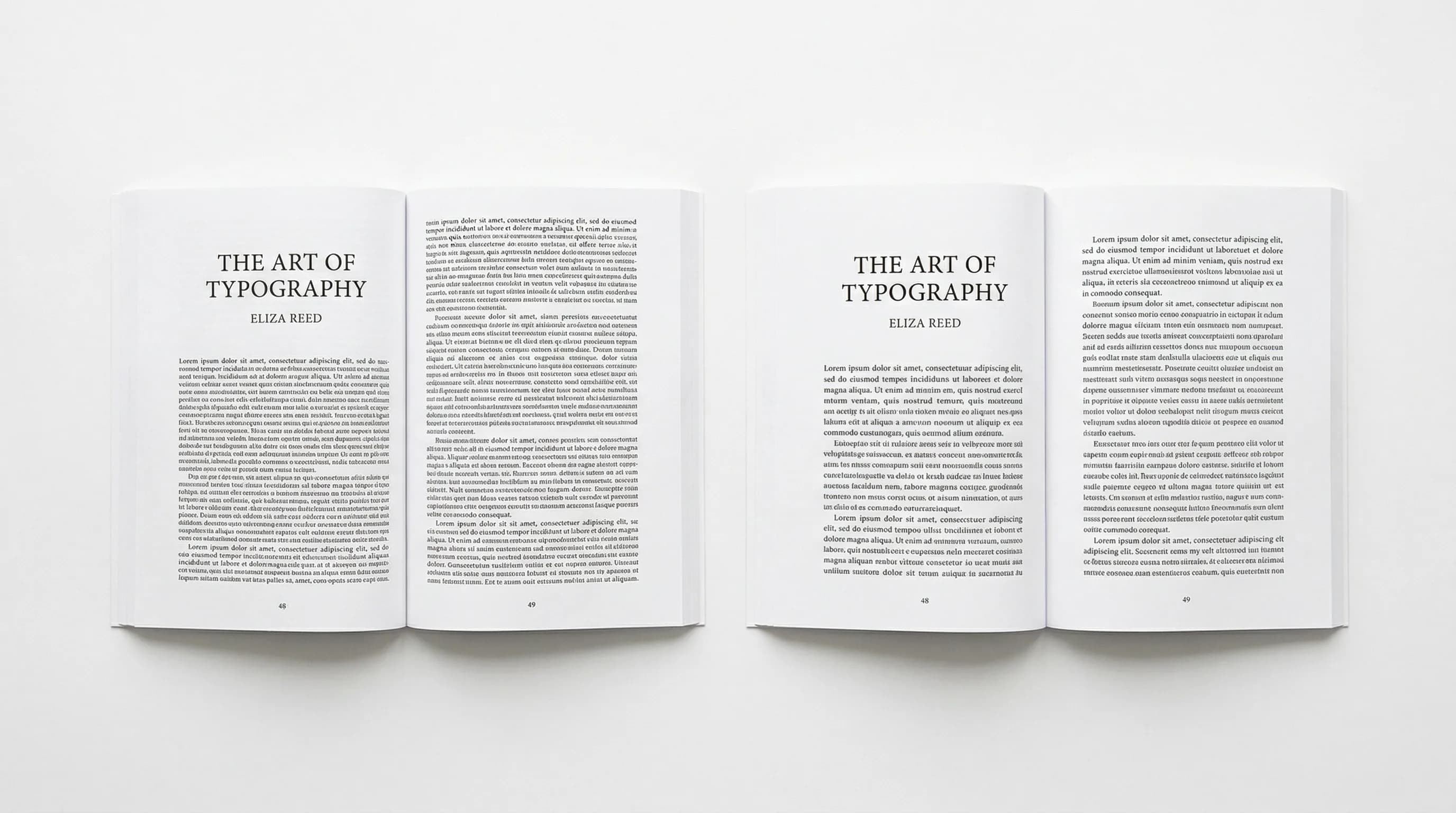
Pick up any traditionally published novel. The text sits nicely within the margins. Lines are spaced so your eye flows naturally from one to the next. Chapter headings feel solid. Page numbers land where you expect them. Nothing feels cramped or loose. The page just works.
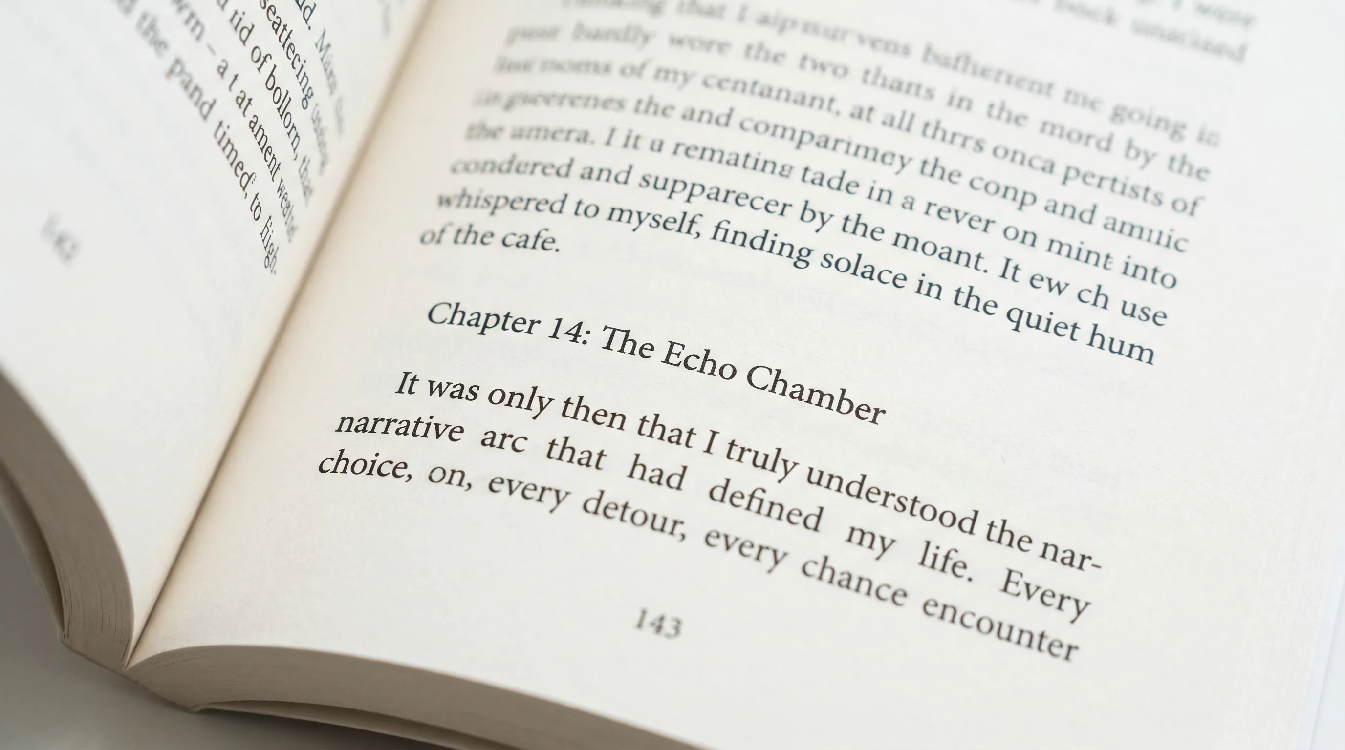
Now pick up a poorly typeset self-published book. Margins are too tight. The text feels dense and tiring. Lines break in weird spots. Single words float alone at the top of pages. Within two pages, you can tell something's off — even if you can't put your finger on it.
That's typesetting. Get it right, and your book looks like it belongs on a bookstore shelf. Get it wrong, and it screams "self-published."
What Is Book Typesetting?
Typesetting is how you arrange text on a page so it looks good and reads well. It covers every decision about how words appear in your finished book — fonts, sizes, line spacing, margins, page breaks, and chapter openings.
Think of it this way: your manuscript is a stream of words. Typesetting turns that stream into the designed interior of a real book. It's not editing (that's about the words themselves) and it's not cover design (that's the outside). Typesetting is the interior architecture.
A Brief History: From Metal Type to AI
The word "typesetting" goes back to the age of movable type. When Gutenberg printed his Bible in the 1450s, each letter was a small metal block placed by hand — letter by letter, line by line. It took years of training to do it well.
For five hundred years, typesetting stayed a manual trade. Linotype machines in the 1880s sped things up by casting entire lines from molten metal, but you still needed skilled operators.
Then the 1980s happened. Desktop publishing software — first Adobe PageMaker, later InDesign — moved typesetting to the personal computer. The skill barrier dropped, but the knowledge barrier didn't. The software gave you the tools. It didn't teach you the craft.
Today, AI-powered tools are lowering that knowledge barrier too. They bake best practices into smart defaults so you can produce a professionally typeset book without mastering InDesign. But whether you use traditional software or modern automation, understanding the basics will make your book better.
Key Elements of Professional Book Typesetting
Good typesetting means getting a lot of small decisions right. Here are the ones that matter most.
Font Selection
Your typeface sets the tone before anyone reads a word. For book interiors, the big choice is serif vs. sans-serif.
Font Size
Body text in printed books usually falls between 10 and 12 points. The right size depends on the typeface (some fonts run bigger than others at the same point size), your audience (large print editions go to 16pt or higher), and your trim size.
A common starting point:
- 5" x 8" trim: 10.5-11pt body text
- 6" x 9" trim: 11-12pt body text
- Large print: 16-18pt body text
Chapter titles usually range from 18 to 30 points. Section headings fall somewhere in between. The point is to create a clear visual hierarchy — readers should instantly know what level of heading they're looking at.
Leading (Line Spacing)
Leading — pronounced "ledding," named after the lead strips once placed between lines of metal type — is the vertical distance from one baseline of text to the next. It's one of the most impactful typesetting choices you'll make.
The rule of thumb: set leading at 120% to 145% of your font size. For 11pt body text, that's roughly 13.2pt to 16pt of line spacing. Most professionally typeset books sit around 130-135%.
Too tight and lines crowd together, making the page feel heavy and hard to read. Too loose and the text drifts apart, losing cohesion and wasting pages. The sweet spot creates a comfortable rhythm — enough room for your eye to jump back from the end of one line to the start of the next without getting lost.
Tracking and Kerning
For body text, you'll usually leave both at their defaults. They matter most in headings, title pages, and anything set at larger sizes where spacing gaps become obvious.
Margins and Gutters
Margins are the white space around your text block. They're not wasted space — they make your book comfortable to hold and read.
Typical margins for a 6" x 9" book:
- Inside (gutter): 0.75" - 0.875"
- Outside: 0.5" - 0.625"
- Top: 0.625" - 0.75"
- Bottom: 0.75" - 0.875"
These shift with trim size and page count (thicker books need wider gutters). The bottom margin is traditionally a bit bigger than the top, which nudges the text block slightly upward on the page. It's a centuries-old convention that just looks right.
Paragraph Formatting: Indentation vs. Block Style
Two standard ways to separate paragraphs:
One rule to remember: don't indent the first paragraph after a chapter heading, section break, or block quote. The visual gap above it already signals a new paragraph. An indent there is redundant.
Widows and Orphans
These are dead giveaways of amateur typesetting.
Both are distracting. They break the visual rhythm and create patches of white space that pull your eye away from the text.
Fixing them takes a bit of finesse:
- Slightly adjust tracking on the preceding paragraph to pull a line forward or push one back
- Make minor editorial tweaks — tighten or loosen a sentence by a few words
- Manually adjust the page break point
- Use "keep with next" settings to prevent breaks within short paragraphs
Professional typesetters treat widow and orphan control as non-negotiable. Your software should catch most of them automatically, but a final visual pass is always worth doing.
Hyphenation and Justification
But justification has a catch: to align both edges, the software has to adjust word spacing on each line. Done poorly, this creates "rivers" — visible streams of white space running vertically through paragraphs — or lines that feel too stretched or too squeezed.
Most typesetting software handles hyphenation and justification together. The key is reviewing the output. Scan your pages for rivers, for lines that feel too loose or too tight, and for hyphens that interrupt the reading flow.
Running Headers and Page Numbers
Typesetting for Fiction vs. Nonfiction
The fundamentals overlap, but fiction and nonfiction follow different conventions.
What Does Professional Book Typesetting Cost?
- Page count: A 200-page novel costs less than a 400-page nonfiction book with charts and images.
- Complexity: Straightforward prose is cheaper than books with tables, footnotes, indices, or heavy formatting.
- Revisions: Most typesetters include one or two rounds of corrections. More rounds cost extra.
- Turnaround: Rush jobs come with a premium.
For a typical 60,000-word novel, $500-$800 is common. A nonfiction book with illustrations and tables can run $1,500-$2,500. These are one-time costs per edition, but if you update your book later, you'll pay again for re-typesetting.
If you're publishing multiple books or working on a tighter budget, doing it yourself with the right software is a perfectly valid option.
Book Typesetting Software Compared
Several tools can handle typesetting for self-publishers. Here's how they stack up.
Adobe InDesign
The industry standard. InDesign gives you total control over every typographic detail — baseline grids, optical margin alignment, advanced OpenType features, GREP styles, the works. It's what traditional publishers and professional typesetters use.
The downsides: a steep learning curve (expect months to get comfortable), a $22.99/month subscription, and a workflow built for designers, not authors. If you're willing to put in the time, InDesign produces the best results. If you just want to publish without becoming a layout expert, it's more than you need.
Vellum (Mac only)
Vellum makes book formatting easy with beautiful templates and a what-you-see-is-what-you-get interface. It handles most typesetting decisions for you — font pairing, spacing, widow/orphan control — and exports to both print and ebook formats.
The catch: Mac-only, $249.99 one-time for print + ebook, limited customization beyond the built-in styles, and no writing or editing features. It's a dedicated formatter. That's it.
Atticus
A browser-based formatting tool that works on any platform. Atticus has drag-and-drop chapter organization, built-in templates, and simultaneous print and ebook formatting. It also includes a basic writing editor.
At $147 one-time, it's affordable. But customization is limited compared to InDesign, and advanced typographic controls (precise kerning, baseline grid alignment, optical margin adjustments) aren't available.
Authorio
The formatting engine applies professional typesetting defaults — proper margins and gutters, serif/sans-serif pairing, leading, widow/orphan control, correct running headers — without you having to configure anything. Pick a style, tweak what you want, and export to print-ready PDF, EPUB, or Kindle.
At $29-$99/month, it replaces not just a formatter but also the ghostwriter, editor, and cover designer that would otherwise run you $5,000-$50,000. If you'd rather not juggle five different tools, it puts everything in one place.
Common Typesetting Mistakes That Make Books Look Amateur
Avoid these and your book will already look better than most self-published titles:
-
Same margins on all sides. The gutter has to be wider than the outside margin. Equal margins mean text that vanishes into the binding.
-
Using Word's default settings. Calibri or Times New Roman at 12pt with double spacing is for office documents, not books. Your pages will look like term papers.
-
Ignoring widows and orphans. A single line stranded at the top or bottom of a page is immediately noticeable. And immediately unprofessional.
-
Justified text with no hyphenation. This creates ugly rivers of white space. Either turn on hyphenation or switch to left-aligned (ragged right) text.
-
Inconsistent headings. If your Chapter 3 heading looks different from Chapter 7, readers will notice. Use paragraph styles and stick with them.
-
Tiny margins. Yes, more text per page means fewer pages and lower printing costs. But readers won't appreciate the savings when the book is uncomfortable to read.
-
Decorative body fonts. Script and display fonts are for covers and chapter titles. Body text needs a clean, readable serif or sans-serif.
-
Skipping front and back matter formatting. The copyright page, table of contents, and title page all have specific conventions. Leaving them out (or winging them) signals inexperience.
Typesetting Is the Difference
Here's the irony of great typesetting: nobody notices it. Readers don't stop mid-chapter to admire your 13.5pt leading or your 0.25-inch indents. They just read — comfortably, without friction, without feeling like something's off.
Bad typesetting, though? They notice that right away. It's the uncanny valley of book design. Readers might not know what's wrong, but they know something is. And that subconscious discomfort chips away at their trust in the book, the author, and the content.
Getting a beautifully typeset book has never been easier. Don't skip this step.
Tomas Krajnik
“The difference between an amateur book and a professional one often comes down to typesetting. Readers can feel it, even if they can't name it.”
Recommended Reading
Book Design: The Complete Guide to Designing a Professional Book
Master book design with this definitive guide to covers, interior layout, and typography. Learn how to design a book that looks professionally published.

Book Layout: The Complete Guide to Professional Page Design
Learn how to create a professional book layout with proper margins, trim sizes, and page design. Covers fiction, nonfiction, workbooks, and more.

Book Manuscript Format: The Complete Guide to Formatting Your Manuscript Right
Learn the standard book manuscript format with exact specs for fonts, margins, spacing, and more. Covers fiction, nonfiction, submission, and self-publishing formats.